Matplotlib
A way to draw things in python, which is better than no way to draw things in python
2014-10-07 — 2023-01-16
Wherein Matplotlib Is Presented as the Classic Python Plotting Library, Its Axes/Axis Terminology Is Clarified and Its Role as a Backend for Wrappers Such as Seaborn and Proplot Is Noted.

The classic python plotting tool is matplotlib. It can’t do all those modern hipster graphs without hard labour and is awful at animations and interactions, and it fugly per default. It works OK out of the box. There are libraries which use matplotlib as a backend and build more elaborate systems on the top, but these have not had much longevity so far, so I find myself falling back to plain old matplotlib. It is an acceptable default with lots of weird edge cases when you try to be clever, but gets the job 80% done.
Note some confusing terminology; An Axes object, which is constructed by an add_subplot command, contains two Axis objects, but is much more than a list of such objects, being the fundamental object upon which a graph is drawn.
But don’t listen to me describe it. Observe this lovely diagram which explains all.
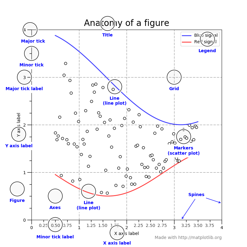
Read Jakevdp’s manual for some pedagogic advice.
1 Pro tips
- If I am using jupyter, the nerdy extension is jupyter-matplotlib which integrates interactive plotting into the notebook better.
- Improving log y-axis plots, esp histograms
- drawnow allows dynamically updated diagrams. It is, ironically, itself updated not especially dynamically.
- Nicolas P. Rougier’ scient visualisation book/rougier/scientific-visualization-book: An open access book on scientific visualization using python and matplotlib
- Loupes: Magnifying Dense regions in Matplotlib plots by Siladittya Manna
2 Interactivity
Confusing.
3 Showing images
Traditionally annoying. There are colorbars everywhere and aspect ratios are horrible and getting multiple images to plot is vexing etc.
There are helpers for this in modern matplotlib. The keyword to look for is mpl_toolkits.axes_grid1. See also the tutorial.
Alternative, use proplot
4 Wrappers with better APIs
matplotlib will always be horrible to ue because the designers were not prophets so some of their early API design guesses were bad, but we are stuck with them for compatibility. There are various attempts to abstract away matplotlib’s horrible API behind nicer ones.
4.1 Proplot
Matplotlib is an extremely versatile plotting package used by scientists and engineers far and wide. However, matplotlib can be cumbersome or repetitive for users who…
Make highly complex figures with many subplots.
Want to finely tune their annotations and aesthetics.
Need to make new figures nearly every day.
Proplot’s core mission is to provide a smoother plotting experience for matplotlib’s most demanding users. We accomplish this by expanding upon matplotlib’s object-oriented interface. Proplot makes changes that would be hard to justify or difficult to incorporate into matplotlib itself, owing to differing design choices and backwards compatibility considerations.
This page enumerates these changes and explains how they address the limitations of matplotlib’s default interface. To start using these features, see the usage introduction and the user guide.
4.2 seaborn.objects
The next-generation seaborn interface attempts to achieve a pythonic equivalent to ggplot, at least somewhat:
as seaborn has become more powerful, one has to write increasing amounts of matpotlib code to recreate what it is doing.
So the goal is to expose seaborn’s core features — integration with pandas, automatic mapping between data and graphics, statistical transformations — within an interface that is more compositional, extensible, and comprehensive.
One will note that the result looks a bit (a lot?) like ggplot. That’s not unintentional, but the goal is also not to “port ggplot2 to Python”. (If that’s what you’re looking for, check out the very nice plotnine package). There is an immense amount of wisdom in the grammar of graphics and in its particular implementation as ggplot2. But I think that, as languages, R and Python are just too different for idioms from one to feel natural when translated literally into the other. So while I have taken much inspiration from ggplot, I’ve also made plenty of choices differently, for better or for worse.
UPDATE this has been released.
- The seaborn.objects interface tutorial
- Joshua Ebner, How to Make a Seaborn Lineplot
- Joshua Ebner, A Quick Introduction to the Seaborn Objects System
4.3 plotnine
Plotnine implements a best-effort clone of R’s ggplot2 library for matplotlib I believe plotnine supersedes the abandoned(?) ggplot.py by yhat (ggplot source, plotnine source).
5 Matplotlib styling
The default matplotlib stylesheet aspires to look like 80s spreadsheet defaults, but if you are not a retrofuturist, you want to change the stylesheet Some of the built-in stylesheets are OK.
Here is an ugly gallery of sometimes-beautiful graph styles. And here is an ugly gallery of sometimes-beautiful colour maps.
Seaborn is another vaunted extension, which I would describe as an “Edward Tufterizer”, originally by Michael Waskom. Extends matplotlib with modern appearance and some missing plot types.
A cute hack to justify matplotlib’s existence: xkcd graphs.
5.1 Margins on saved graphics are too large
5.2 Axis labels
Suppressing?
6 Glue
An interactive exploratory matplotib GUI toolkit/app is glue. They have solved a lot of python gui problems, bless them, and have tried to make everything more-or-less interactive.
Glue is designed with “data-hacking” workflows in mind, and can be used in different ways. For instance, you can simply make use of the graphical Glue application as is, and never type a line of code. However, you can also interact with Glue via Python in different ways:
- Using the IPython terminal built-in to the Glue application
- Sending data in the form of NumPy arrays or Pandas DataFrames to Glue for exploration from a Python or IPython session.
- Customising/hacking your Glue setup using
config.pyfiles, including automatically loading and clean data before starting Glue, writing custom functions to parse files in your favorite file format, writing custom functions to link datasets, or creating your own data viewers.Glue thus blurs the boundary between GUI-centric and code-centric data exploration. In addition, it is also possible to develop your own plugin packages for Glue that you can distribute to users separately, and you can also make use of the Glue framework in your own application to provide data linking capabilities.
7 Image montage
I have an array of images in arr. How can I plot them on a nice simple plot? I need to do this all the time. If I have skimage installed I can use the montage function. I do not always have that installed though. Here is a snippet to do it by hand:
Alternative, use proplot.
8 Math-friendly fonts
8.1 Help matplotlib cannot find my font
Corrupt font cache? Some places we see this advice
That does not work for me as of matplotlib 3.6. What does is finding the path thusly:
and then removing it with rm -rf. Still cannot find that fint? what if you are on the HPC?
Harriet Alexander advises setting up truetype fonts properly.
8.2 tikzplotlib
Agustinus Kristiadi, in The Last Mile of Creating Publication-Ready Plots introduces texworld/tikzplotlib,, which is a tikz plotting backend; why do we want this? For one, it can match fonts to the parent document.
8.3 Basic font stuff
Someone made the idiosyncratic choice that default font is sans serif, even for mathematical text. You can change this by setting serif fonts also for mathtext.
Supported math fonts are reputedly
- dejavusans (the horrible default)
- dejavuserif (beware of odd greek letters)
- cm (“Computer Modern”. Classic, dated.)
- stix (modern serif, looks OK)
- stixsans (sounds like sans serif to me)
I am not aware of any publications which use those fonts in their style guides, but the difference between, say Deja Vu Serif and Times New Roman is small enough that only font nerds notice.
Alternatively I can render graph labels with TeX which leads to some weird spacing but allows me to match fonts better. It is also fragile and character set issues are terrible. Are these problems eased if I use XeLaTeX/LuaLaTeX?
Further suggestion: Automate these selection problems away using TUEplots.
TUEplots is a light-weight matplotlib extension that adapts your figure sizes to formats more suitable for scientific publications. It produces configurations that are compatible with matplotlib’s rcParams, and provides fonts, figure sizes, font sizes, color schemes, and more, for a number of publication formats.
import matplotlib.pyplot as plt

from tueplots import bundles

bundles.icml2022()
{'text.usetex': True, 'font.family': 'serif', 'text.latex.preamble': '\\usepackage{times} ', 'figure.figsize': (3.25, 2.0086104634371584), 'figure.constrained_layout.use': True, 'figure.autolayout': False, 'savefig.bbox': 'tight', 'savefig.pad_inches': 0.015, 'font.size': 8, 'axes.labelsize': 8, 'legend.fontsize': 6, 'xtick.labelsize': 6, 'ytick.labelsize': 6, 'axes.titlesize': 8}

# Plug any of those into either the rcParams or into an rc_context:

with plt.rc_context(bundles.icml2022()):
    pass
I am indebted to my colleague Christian Walder for suggesting the following as a reliable initialisation procedure for matplotlib plotting with equations.
import matplotlib
import sys, os

# GTK GTKAgg GTKCairo MacOSX Qt4Agg TkAgg WX WXAgg CocoaAgg
# GTK3Cairo GTK3Agg WebAgg agg cairo emf gdk pdf pgf ps svg template

is_mac = sys.platform == 'darwin'
if is_mac:
    _matplotlib_backend = 'MacOSX'
else:
    _matplotlib_backend = 'pdf'

matplotlib.rcParams['svg.fonttype'] = 'none'
matplotlib.rcParams['backend'] = _matplotlib_backend
matplotlib.rcParams['mathtext.fontset'] = 'stix'
matplotlib.rcParams['font.family'] = 'Times New Roman'

matplotlib.use(_matplotlib_backend)
import matplotlib.pyplot as plt
import matplotlib as mpl

plt.switch_backend(_matplotlib_backend)
# print(matplotlib.pyplot.get_backend())
try:
    import cairocffi as cairo
except:
    pass
    # logging.warning('import cairocffi failed')

_latex_preamble = [
    r'\usepackage{amsmath,bm}',
    r'\newcommand\what{\hat{\bm{w}}}',
    r'\newcommand\tr{^\top}',
    r'\newcommand\dt[1]{\left|#1\right|}',]

_latex_path = '/Library/TeX/texbin/'


def use_latex_mpl(
        latex_path=_latex_path,
        latex_preamble=_latex_preamble):
    mpl.rcParams['text.usetex'] = True
    mpl.rcParams['text.latex.preamble'] = latex_preamble
    if latex_path is not None:
        os.environ['PATH'] = '%s:%s' % (os.environ['PATH'], latex_path)
9 Yellowbrick
Yellowbrick is a matplotlib specialisation for hyperparameter optimisation.
Yellowbrick extends the Scikit-Learn API to make model selection and hyperparameter tuning easier. Under the hood, it’s using Matplotlib.