About this site
2009-03-05 — 2025-01-20
Wherein the site’s nature is described and the content is rated on a three‑point scale for Usefulness, Novelty, Uncertainty and Roughness, and its publication workflow is managed via Quarto and Netlify.
1 Ratings
Content on this site is rated on a 3-point scale by Usefulness (🔧), Novelty (💡), Uncertainty (🤪), and Roughness (🚧). The Uncertainty rankings should be interpreted as follows:
1.1 Uncertainty
- 🤪🤪🤪
- Ignorant. I know only enough about this topic to know I know nothing.
- 🤪🤪
- Dunning-Kruger. I know enough about this topic not to know my own ignorance.
- 🤪
- Competent. I know this topic well enough to know what I do not know. Or so I think.
Other scales are analogous.
1.2 Usefulness
🔧🔧🔧 means useful. This article represents a meaningful synthesis of available information that could not be gleaned from a simple Google search. 🔧 denotes a mere placeholder or listicle.
1.3 Roughness
🚧🚧🚧 is essentially an apology. I have not remotely edited any text so labelled, and it is going to sound like the ramblings of my subconscious, whereas 🚧 means I have buffed the prose to adequacy. I rarely get to buff prose to perfection, except for conference papers.
1.4 Novelty
The most challenging category. The extremely rare 💡💡💡 indicates substantive content that I derived myself, but the more common 💡 means that the knowledge therein is, like most human learning, recycled from what someone else told me.
1.5 Automation
- 🤖
- Minimal AI assistance. Cosmetic checking, reference finding, mostly mined by hand.
- 🤖🤖
- A perfect centaur, human and machine working together as a whole greater than the sum of their parts.
- 🤖🤖🤖
- I needed a briefing so I got an LLM to vomit this hallucinatory stilted mess onto the page for later analysis.
2 Assumed audience
Here and there, I use the term “assumed audience”, cribbed from Chris Krycho. …
I liked Chris’s placards as soon as I saw them; I appreciate the way they push back against the “context collapse” of the internet, in which every public post is, by default, addressed to everyone.
3 General structure
Many ideas about how this site is used and presented are cribbed from the notebooks of Cosma Shalizi, which I find a pleasant format to read. And to write, as my personal public Memex. I justify this (but post hoc!) as Digital Gardening. The content is my own, except where otherwise stated. Some of the more quixotic choices about site design I made despite Gwern’s arguments about returns to design.
Firstly,
the joy of web design & typography is that just its presentation can matter a little to all your pages. Writing is hard work, and any new piece of writing will generally add to the pile of existing ones, rather than multiplying it all; it’s an enormous amount of work to go through all one’s existing writings and improve them somehow, so it usually doesn’t happen. Design improvements, on the other hand, benefit one’s entire website & all future readers, and so at a certain scale, can be quite useful. I feel I’ve reached the point where it’s worth sweating the small stuff, typographically.
But contrapunctually,
This suggests a dangerous idea (dangerous because a good excuse for complacency & mediocrity, especially for those who do not manage even mediocrity but believe otherwise): if you are going to invest in design, half-measures yield less than half-results. If the design is terrible, then one should continue; but if the design is already reasonable, then instead of there being substantial returns, the diminishing returns have already set in, and it may be a too-long slog from where you are to the point where people are impressed enough by the design for the aesthetic effect to kick in. Those moderate improvements may not be worthwhile if one can only modestly improve on mediocrity;
Oops.
The fiddly details of how this site works are here, and the really fiddly in-progress details are on my TODO list.
4 Subscribe to updates
You could, if you wished, subscribe to updates in a feed reader of your choice. Here are some buttons to that end, at the request of Andy:
5 Technical details
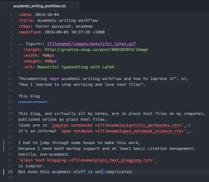
This blog is a static site, i.e. I see plain text files; you see fancy online HTML. This particular blog uses Pelican Blogdown Quarto, but there are many options. The HTML is automatically served by github pages netlify, which is fast and free. The citations are handled through Zotero. This is a work in progress.
For now, I mostly edit the text using VS Code, or RStudio, both of which have integrated preview.
Here’s a tight, reader-friendly summary that explains your whole pipeline without lapsing into implementation detail — something you could drop straight into an “About this site” section:
6 AI usage
I use AI to process the articles on this site in various ways.
Copy-editing. A lightweight language model reviews only the editable text (not quotes) and corrects grammar, spelling, and style; it’s basically a mildly aggressive spellchecker. I manually accept or reject all such updates, albeit with varying levels of scrutiny.
Summarising. That little “Wherein …” summaries at the top of the post are generated by a model primed to imitate Victorian novels. Those are purely automatic, essentially because I find it amusing.
Indexing. An embedding model digests each post and produces a vector representation that is stored in a vector database. This generates the “suspiciously similar” recommendations for posts and the 3d blog map on the home page.
Scoring. A short model call samples the opening of each post and rates its quality (0–10) for clarity, originality, and usefulness. You don’t see these scores, but they influence the site’s front page ordering, since they feed into the “frecency” (freshness-weighted quality) score via the formula:
\[ \text{frecency} = Q2^{-t/H} \] where Q is quality (0–1), t is age in days, and H is a half-life. This ensures the front page favours recent writing, but a really spicy good post can sneak ahead of newer, scruffy ones.


