Visualising probabilistic graphical models
Also related models, such as Neural nets
2018-03-29 — 2026-01-13
Wherein Probabilistic Graphical Models Are Surveyed and Practical Tooling for Directed Flow Graphs Is Catalogued, With Particular Attention Given to Plate Notation, Inline Math and SVG/PDF Export.
The diagrams I most often need are directed flow graphs — a formal mathematical cousin of the flowchart — that can represent graphical models and neural nets. That is, my needs are nearly flowchart-like enough that I can sketch them with a flowchart tool if need be; but they’re closely integrated with the equations of a particular statistical model, so I’d like to incorporate them into the same system to avoid tedious, error-prone manual synchronization if possible. Further, there are a couple of things I’d like handled that flowchart programs are bad at, such as plate notation, inline mathematical markup, and representing network topologies.
As always, I’d like to export the resulting diagrams to modern, compatible vector formats, which means SVG, PDF. As a fallback, I’d accept other formats that can be converted to the above, such as Adobe Illustrator, EPS, or xfig.
1 pgmpy
pgmpy is a Python package for causal inference and probabilistic inference using Directed Acyclic Graphs (DAGs) and Bayesian Networks with a focus on modularity and extensibility. Implementations of various algorithms for Causal Discovery (a.k.a, Structure Learning), Parameter Estimation, Approximate (Sampling Based) and Exact inference, and Causal Inference are available.
Importantly for the current context it also does diagram rendering::
pgmpy offers a few different ways to plot the model structure.
- Using pygraphviz
- Using networkx.drawing module
- Using daft
2 dagR
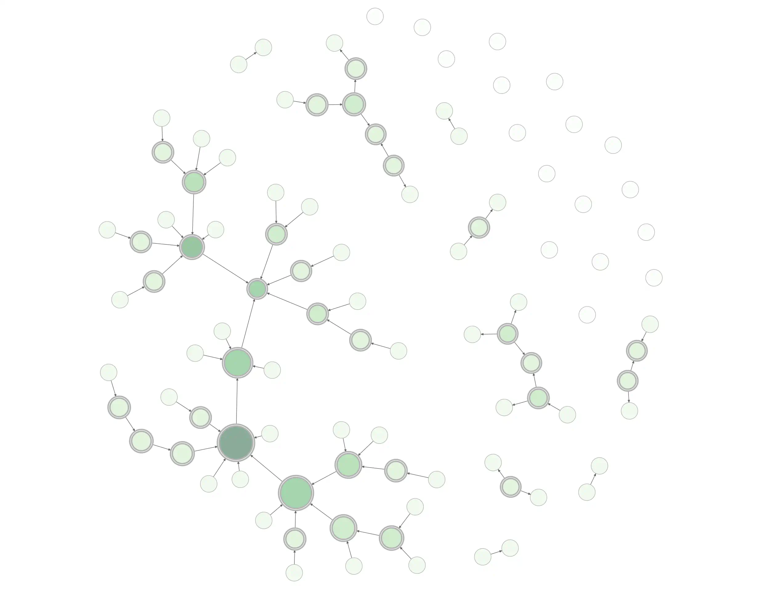
After initialising a new DAG using a command line, the researcher can evaluate what associations are introduced by adjusting for covariables. Potentially biasing paths from exposure to outcome can be identified (see eFig. 1, demonstrating harmful adjustment using an example DAG from Fleischer and Diez Roux). Functions to conveniently add or remove nodes and arcs are included, as is a function checking introduced associations and biasing paths for all possible adjustment sets […]. The graphics capabilities of R allow fairly straightforward programming of basic DAG drawing routines, while also supporting the interactive repositioning of nodes and arcs.
The package also calculates adjustment sets and other useful graph functions.
3 TikZ
LaTeX-friendly diagramming tool TikZ includes a graphical model library, jluttine/tikz-bayesnet, called “TikZ library for drawing Bayesian networks, graphical models and (directed) factor graphs in LaTeX”.
4 diagrammeR
DiagrammerR is a generic graph-visualization app for R that also creates graphical models.
With the DiagrammeR package you can create, modify, analyse, and visualize network graph diagrams. The output can be incorporated into RMarkdown documents, integrated with Shiny web apps, converted to other graph formats, or exported as image files.
5 diagrams.net
diagrams.net (formerly draw.io) is a browser-based diagram editor. It’s a general diagramming tool that offers many features useful for graphical models.
- desktop version
- integrated into jupyter
- integrated into VS Code
6 Mermaid
Another browser option is mermaid, a flowcharting tool we can press into service for DAGs. Unique value proposition: code-driven diagrams with a syntax so basic we find it easier than point-and-click. It integrates with many markdown editors. It has an online editor and a CLI.
It also has, if anything, too many VS Code integrations. Here are two.
7 penrose
It seems to handle DAGs to some extent.
See penrose.
8 Graphviz
The graphviz family is pretty good — it supports graphing a variety of networks, including probabilistic DAGs. Inevitably, its fancy algorithms never lay out graphs quite the way I want.

fastdot theme
- numpyro automatically renders graphviz graphical-model diagrams via the
render_modelmethod. - Pyro does too
- There’s a Python graphviz wrapper that probably has the best documentation for graphviz in general.
- fastdot.core wraps pygraphviz in a slightly nicer API.
- dot2tex is a Graphviz-to-LaTeX converter that supports mathematical markup in nodes.
- And graphviz renders in Jupyter. (See also other Jupyter options)
- It runs in R via diagrammeR.
- It runs in JavaScript as viz.js.
- And the traditional style is supported via Rgraphviz
For some purposes I recommend dagitty instead; the syntax is similar, and dagitty also accepts specification by a structural equation model.
9 Dagitty
dagitty (Textor et al. 2017) is an option for the browser and also for R. I’m not entirely sure how the two parts relate. Documentation for the R version was hard to find—see here.
ggdag extends daggity to the ggplot ecosystem. The ggdag bias structure vignette shows useful explanatory diagrams available in ggdag and is a good introduction to selection bias and causal DAGs themselves.
Shinydag provides a web interface to ggdag. Shinydag can be tedious to install natively because the documentation is poor. It runs okay in docker.
Now Shinydag is waiting for us at 127.0.0.1:3838/shinyDAG. It’s a bit crashy and clunky. I’m not sure I prefer Shinydag to plain ggdag.
10 Cytoscape
Cytoscape is an open source software platform for visualising complex networks and integrating these with any type of attribute data. A lot of Apps are available for various kinds of problem domains, including bioinformatics, social network analysis, and semantic web.
11 Matplotlib
How to diagram convnets using Matplotlib in Python: diagramming convnets using matplotlib in python. Or try: daft-pgm
Daft is a Python package that uses matplotlib to render pixel-perfect probabilistic graphical models for publication in a journal or on the internet. With a short Python script and an intuitive model-building syntax you can design directed (Bayesian Networks, directed acyclic graphs) and undirected (Markov random fields) models and save them in any formats that matplotlib supports (including PDF, PNG, EPS and SVG).
We find it OK for programmatic DAG rendering; we’d like it to have a semi-automatic layout algorithm.
12 yEd
yEd’s a low-key, nerdy diagrammer.
yEd supports a wide variety of diagram types. In addition to the illustrated types, (BPMN Diagrams, Flowcharts, Family Trees, Semantic Networks, Social Networks, UML Class Diagrams) yEd also supports organization charts, mind maps, swimlane diagrams, Entity Relationship diagrams, and many more.
Found via A blog by Jonas Kristoffer Lindeløv, where he walks through the pluses and minuses:
yEd is purely graphical editing which is fast to work with and great for tweaking small details. A very handy yEd feature is its intelligent snapping to alignments and equal distances when positioning objects. Actually, I don’t understand why yEd almost never makes it to the “top 10 diagram/flowchart programs” lists.
A few things I learned: To make subscripts, you have to use HTML code.… it is not possible to do double-subscripts. Also, the double-edges node is made completely manually by placing an empty ellipse above another. […] A final limitation is that arrowhead sizes cannot be changed. You can, however, zoom. Therefore, your very first decision has to be the arrowhead size. Zoom so that it is appropriate and make your graphical model.
13 Bokeh
14 Netron
Netron visualizes various neural networks from several frameworks.
As far as I can tell, its style is useful for diagnostics but doesn’t match the more polished look I’d use for a publication. I should probably dig deeper.
15 flowchart.fun
flowchart.fun (source) is a flowcharting tool that we can use for DAGs. The documentation and project goals are sparse.
16 TETRAD
TETRAD, the graph inference software, can also visualize structural equation models.
17 PlotNeuralNet
It does what it says on the tin, especially if we want to make convnets look pretty: HarisIqbal88/PlotNeuralNet: LaTeX code for making neural network diagrams.
18 tikz
Laura Dietz and Jaakko Luttinen created TikZ macros for drawing Bayes nets in LaTeX: tikz-bayesnet.